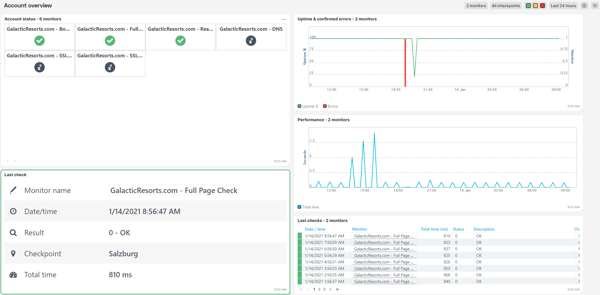
Some time back we introduced the new app menu as a beta feature. Several of you have tested this side menu already. The next step in the renewal of the user interface is the restyling of the dashboards and tiles. Here’s an impression of the new look and feel:

Note that the changes in the dashboard are not related to using the new side menu. The new look and feel is there, also when you are using the classic menu.
Check out the UI changes and share your feedback! This is pretty easy. Just go to to quickly drop us a line of comment.